The Cancara Philosophy... eh?


Take a 330-year-old bank, throw in a new CMO, and you might expect the usual suspects: fresh fonts, new shades of green, maybe a rousing line about 'financial futures'. But Lloyds didn’t do that. Not really. What Wolff Olins delivered goes way deeper.
The Idea: Everyone has a next step forward.
Simple. Human. Strategic. Love it. It acknowledges the tension we’re all living with. Wanting to move forward, not always knowing how. That became the bedrock for a brand that doesn’t just sling mortgages and savings accounts, but actually meets people where they are, then gives them a gentle push in the right direction.
The new positioning: “Lloyds moves everyone forward.”
On paper? Soft. But in practice? Clever AF. Because great brand strategy isn’t about shouting louder. It’s about building an overarching idea that works just as hard internally as it does externally. And this one does. Lloyds already had “Helping Britain Prosper”. It was broad, lofty and smelled like 2012. “Moving forward” is actionable. It’s something you can design, write and build for.
The Cancara Philosophy
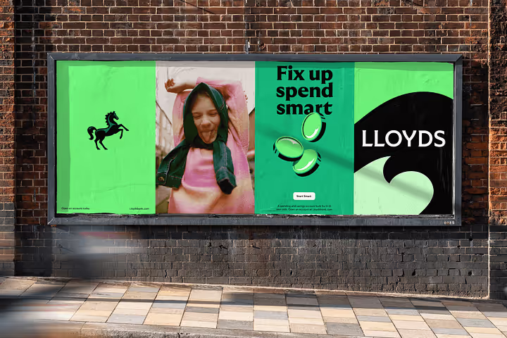
For those of you old enough to remember (I’m not!), “Cancara” was the name of the original black horse from Lloyds’ 1980s campaigns. But this isn’t a nostalgic throwback. They reimagined the horse as a system. A brand behaviour. Naming your design system after a horse could’ve gone cringeworthy fast. But here? It’s sharp.
- The logo moves with intention, like a real horse.
- Motion principles across digital mimic ‘equine flow’ (weirdly elegant).
- Photography and tone are all strength, warmth, and restraint. Think less Getty stock, more cinematic stills.
- Typography (customised GT Ultra) blends classic heritage with modern pulse.
- The green palette nods to British landscapes.
- The tone of voice dry wit with a backbone. It makes you smirk.
This is why the rebrand works.
Because it actually thinks. It’s not just pretty. It has cohesion. Every element: visual, verbal, emotional, sings the same note. In finance, that’s unicorn rare. Most rebrands in the sector feel like five committees tried to ‘do a Monzo’ and ended up somewhere between bland and baffling. Lloyd’s overall rebrand is stunning. But it’s the thinking underneath that deserves the spotlight.
Here’s how you can sense-check your brand’s POV
1. Start with a point of view, not a marketing line.
Run it through this filter:
- Could a product team build something from this?
- Could a copywriter write from it?
- Could it steer a meeting?
For Lloyds, it was “Everyone has a next step forward.” Not just a line. An operating idea. It acknowledges where people are and offers a promise: we’ll help you move.
2. Build a philosophy, not just a system.
Turn your identity system into a belief system. This doesn’t mean a moodboard. It's a point of view with reason. What does the brand do in motion, behaviour, and language? They even brought in an actual horse expert for f*** sake! That’s the difference between a facelift and a belief-led brand.
3. Design for how the brand works, not just how it looks.
Treat your brand like software. Design modular systems. Create behaviours, not just assets. Build flexibility into the rules so things can stretch without snapping. Lloyds’ rebrand acts like an OS. It scales across app UX, OOH, merch, language and tone, all without losing rhythm. That’s why it feels so seamless. It’s intelligent, not rigid.
4. Let TOV do the heavy lifting.
Don’t write like a brand. Write like a person with a point of view and push every line to do more than one job. One of the most underrated elements of the Lloyds rebrand is the tone of voice. It’s witty without trying too hard. British, without leaning on cliché. Lines like “Freeze your card (For when it’s your round)” and “Because golf is not a pension plan” do more than land a smile, they communicate values, features, and relevance in one hit.
Final thoughts
A lot of rebrands chase relevance. This one chased resonance. And that’s what makes it brilliant. Take notes.
More nuggets of value


The only thing standing between being an option and becoming the obvious choice is your brand positioning.
