Figma's rebrand taught me a lesson...


Fight it all you want. You’ll end up loving it anyway.
I’ll admit it. I wasn’t a Figma guy. I was Adobe XD through and through, and the idea of switching felt like a headache I didn’t need.
But when the industry moves, you move. And Figma was setting a new standard. We romanced the idea of switching to Figma at Unearthed and before you know it, I fell hard. Not because I wanted to, but because Figma was that good. And Figma knew it…
Quick history: From niche design tool to industry giant.
Figma launched in 2016 as a browser-based design tool, disrupting a market dominated by heavyweight software like Sketch and Adobe. The selling point? True cloud collaboration. No more file versions. No more ‘Final_Final_ReallyFinal_V3’ It was built for designers but evolved for developers, PMs and marketing teams looking to collaborate seamlessly. They had to evolve to become the industry standard the brand had to follow.
The rebrand: Activating growth-mode
There’s an old saying: You can’t be everything to everyone. Figma proved otherwise.
After Adobe’s failed $20 billion acquisition, Figma went full throttle, repositioning itself as a platform for all creative and technical roles. This shift wasn’t about fixing something broken but making sure the brand matched its scale, ambition, and growing user base. Fun Fact: As of 2024, Figma has over 4 million users.
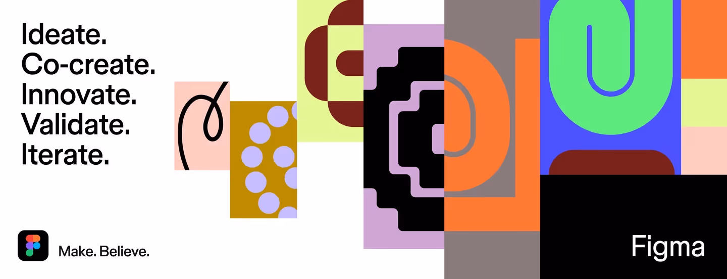
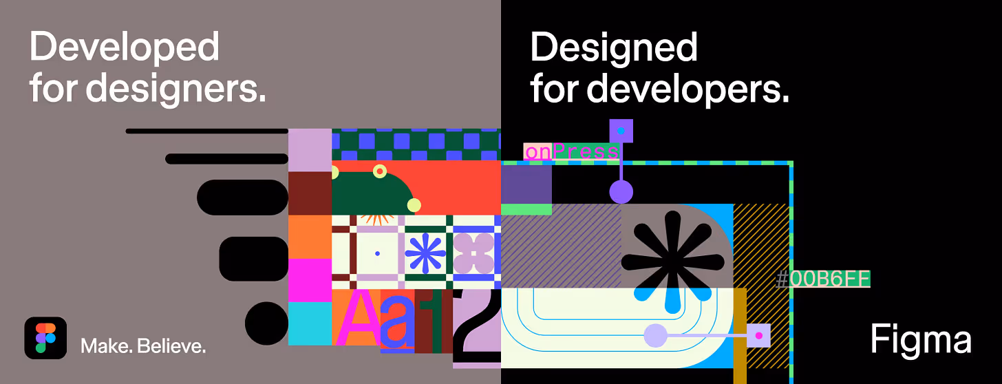
Their new identity ditched the hyper-specific ‘design software’ look and instead leaned into abstract, playful, and adaptable visuals that feel more like a creative ecosystem than a rigid tool. It’s confident, but flexible. Playful, but functional. And crucially: it speaks to everyone: designers, developers, PMs, and entire product teams.
A visual strategy to learn from
1. The typeface that means business: Figma Sans
Figma teamed up with Grilli Type to create Figma Sans, a clean, professional grotesque font that balances neutrality with personality. Unlike its predecessor, which had exaggerated details, this one is sleek and unobtrusive designed to flex across different audiences and contexts.
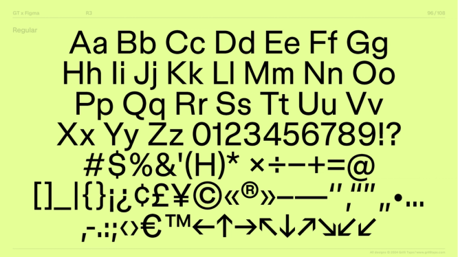
Take away: Invest in typography that scales with your brand. The right typeface should be a workhorse, not a decoration.
2. An abstract visual system.
Old Figma relied on simple geometric icons that were unmistakably ‘design software.’ The new system introduces primitives: basic shapes that can be adapted into countless forms. They reflect the fluid, ever-changing nature of collaboration rather than rigid toolset metaphors.
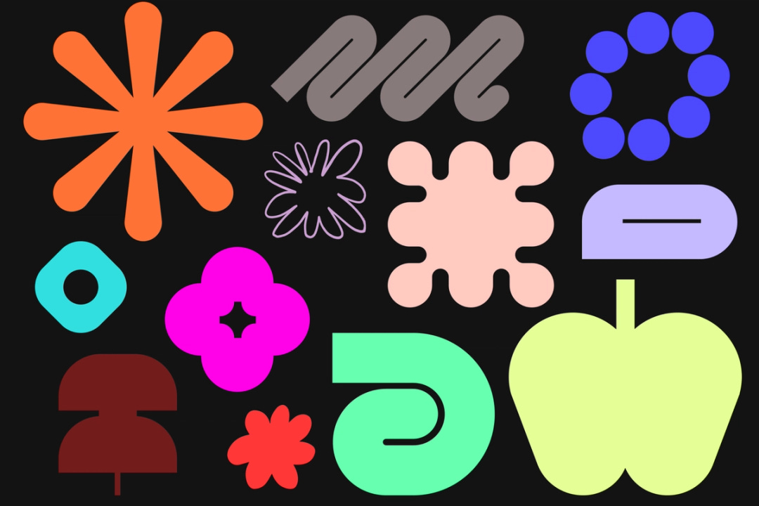
Take away: Build a flexible brand identity. A system that can adapt and evolve is more powerful than one that dictates strict rules.
3. Motion as a core element
Figma's new visual language isn’t static. Motion plays a starring role, mimicking how objects interact in the platform. Nodes animate. Elements shift. Selection states are highlighted. It all reinforces Figma’s core function: interactive, real-time collaboration.
Take away: Motion isn’t an afterthought. It’s an experience. If your product or brand is dynamic, your visuals should reflect that.
4. Beyond the hero colour
Most brands pick one dominant colour and stick to it. Figma went the other way. Rather than owning a single colour, it introduced an expansive, high-contrast palette that mirrors the diversity of its users and use cases.
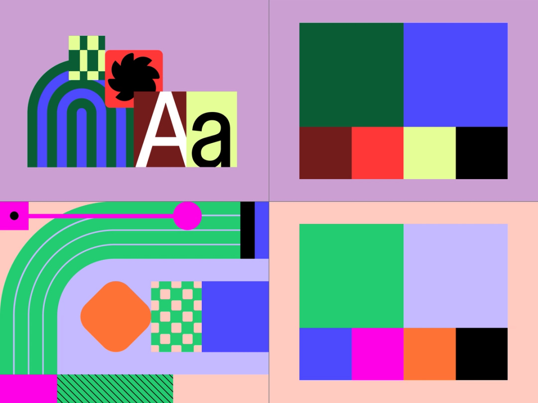
Take away: If your audience is diverse, your brand should reflect that. Monolithic colour schemes don’t always serve modern brands.
5. Speaking to developers without alienating designers
Figma has historically been designer-first, but the reality is that one-third of its users are developers. The new brand system incorporates UI elements that subtly nod to code environments, like Figma Mono, a monospaced typeface designed specifically for dev mode.
Take away: If your audience is evolving, your messaging needs to evolve with it. Speak to new users without losing your core.
A masterclass rebrand? I’d say so.

Figma didn’t fix what wasn’t broken. The Figma logo? Untouched. Why? Because the brand equity was already there. Instead of overhauling the logo, they focused on making everything around it more scalable and functional.
They leaned into their own evolution. Figma isn’t just a design tool anymore, so why should it look like one? The rebrand reflects its shift from niche software to a collaborative product suite.
This was part of their growth strategy not looking pretty. But reaching more users, cementing their position as the go-to collaboration platform, and ensuring the Figma brand can flex as it continues to expand. This is a playbook on how to scale without losing what makes you great.
This is how you evolve without losing yourself. Brands, founders, and strategists should take notes.
More nuggets of value


The only thing standing between being an option and becoming the obvious choice is your brand positioning.
