Ever made a concrete block…sexy?


We did. And not in the weird AI way. I’m talking: brand-first and crazy good visuals. The sort of thing trade companies just don’t do.
Because here’s the truth: The more “functional” a product is, the more likely its brand is hiding behind bullet points and ISO certifications. Weight. Density. Fire rating… not very sexy. Fine. It’s not supposed to be. And that’s the opportunity.
Let’s Talk About the Block
Lignacite is about as legacy as it gets in UK construction. Think: The Shard, The Gherkin, Google HQ. Their Eco Range is a high-performance concrete block made with up to 70% recycled materials, independently verified carbon savings, class A1 fire rating, and they deliver using HVO-fuelled trucks.
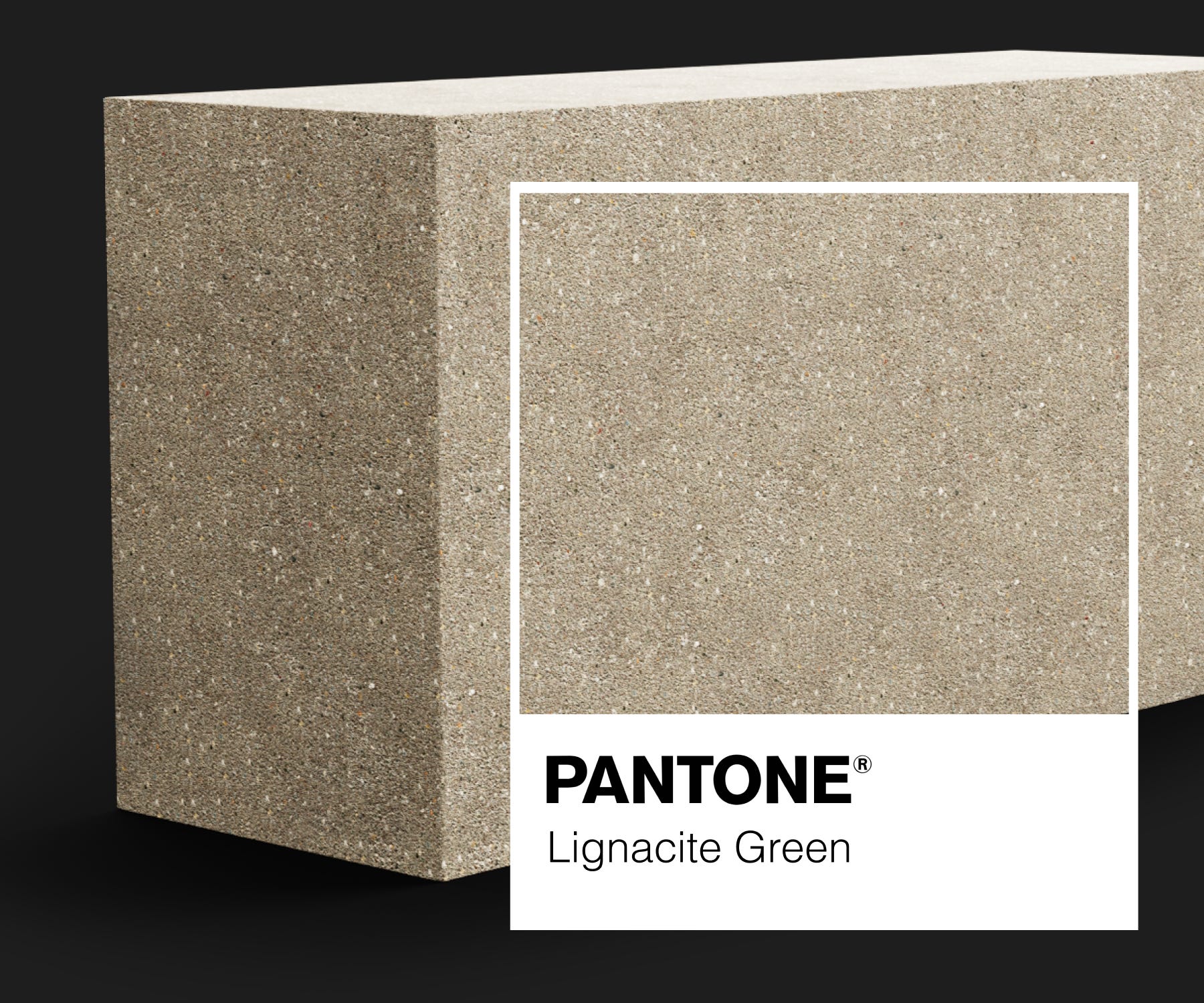
Basically, if Greta Thunberg built a house, this is the block she’d spec. But here’s the problem: it looked like every other block. Grey. Rectangular. Set in stone. We had to make it matter. Because it wasn’t just another grey block. It was also… green?
The Creative Concept: This Block Is Green. So Is This One.
The creative concept needed to do one thing: cut through the noise without pretending this was anything other than what it was: a better brick. It’s accurate, witty, and unashamedly relevant.
It let us lean into the eco story without overplaying it, and gave us permission to say the obvious things in ways that felt fresh. Note: This is how you don’t greenwash. You tell the truth. Clearly. Confidently. Without the violins.
The Design: Sustainability × Innovation × Clarity
We built a system that was clean, not clinical. Soft black backgrounds, bright green accents.
Premium. Progressive. Proudly different. The 3D renders featured Lignacite blocks slowly overgrown with flora. Not just pretty. Purposeful. It’s a subtle way of saying: this is eco, without being nature-themed.
And yes, the visuals literally tumble down the site. Have a look.
The Messaging: No Excess
We said many things in not very many words. Because no one’s reading your spec sheet if they can’t first be bothered to land on the page. “Cutting Carbon. Not Corners.” It’s a line. A standard. A subtle jab. An alliteration. It’s memorable, which, in a sea of “eco solutions,” is the whole point.
The Web Development: A New Standard
Most 75-year-old construction companies are still figuring out how to centre a logo.
Lignacite launched a carbon calculator. This wasn’t a brochure site. We built it like a tool. Toggle comparisons. View spec sheets without friction. Punch in your project and get real-world carbon savings on the spot. It answers questions before you even ask them.
Smart, seamless, and by trade sector standards, kind of ridiculous.
Why Am I Telling You This?
Because Lignacite isn’t a unicorn startup. They’re not VC-backed. Not Silicon Valley adjacent.
They make building blocks. And they dared to brand them like they mattered. Maybe you’re in a similar space. A “grey” industry. A crowded category. Competing on features, benefits, or (worse) price.
Because there are 10 others just like you. But when you begin to stand out? You don’t have to fight for every brief. People come to you. They drop your name at the next meeting. They reference your site in pitch decks. They trust you before they even speak to you. We didn’t reinvent the wheel. Or the concrete block. We just made the case for this one clearly. Most times, you don’t need a new product. You need a new story.
It’s Not Just Us
We’re not the only ones building brands around the unremarkable. When the bar is low, it doesn’t take much to stand out - it just takes guts.
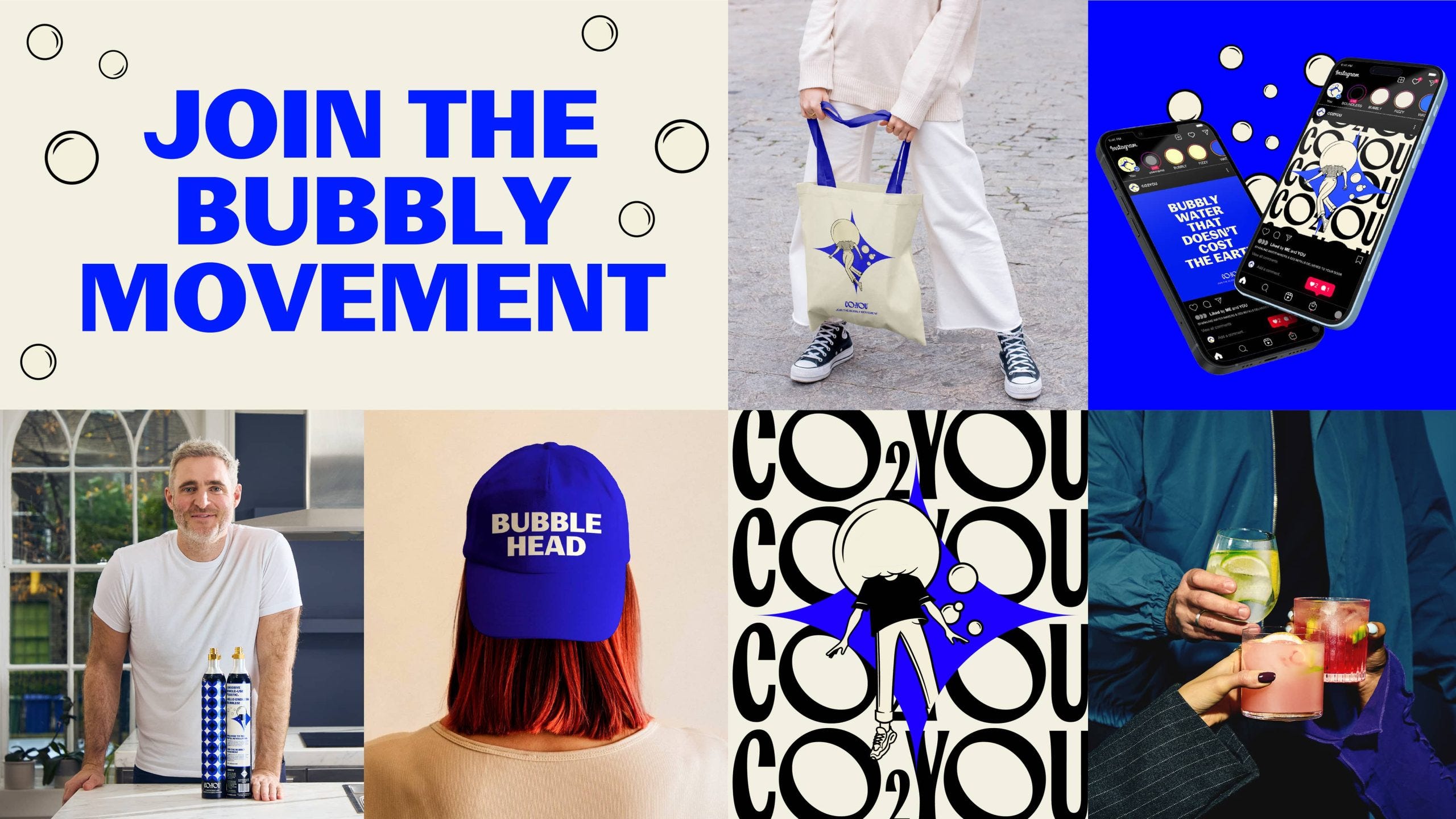
CO2You
A gas canister that looks like a fashion product. Bold branding. Precision copy.
It’s industrial design that’s actually designed. And suddenly, it feels less like maintenance and more like modernity.
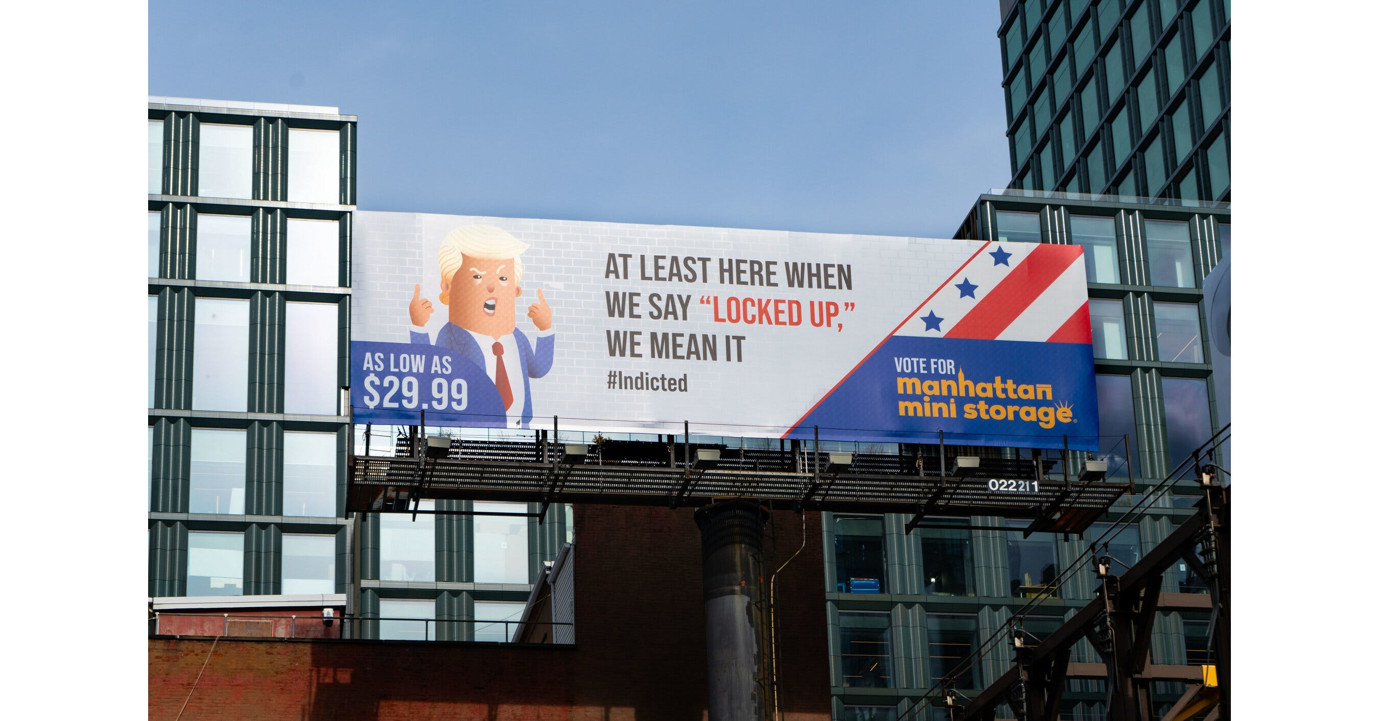
Manhattan Mini Storage
Storage isn’t sexy. But sarcasm is. Their ads don’t push features. They push feelings.
A masterclass in using cultural commentary to elevate the completely forgettable.
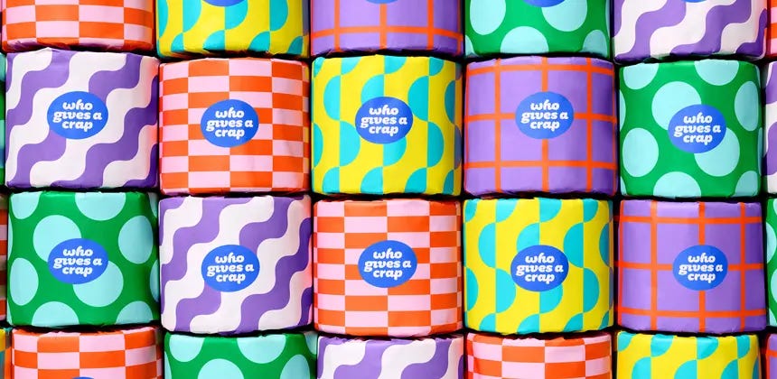
Who Gives a Crap
Toilet paper. Literally. And yet, it's colourful, mission-led, and somehow giftable.
They didn’t just brand the product. They branded the guilt. The better choice. The social flex.
The Final Takeaway
You might need a rebrand. Because the things we label “boring” are often just waiting for someone to say something interesting. We made a block sexy. But the real takeaway: even if your product lives in the background, your brand doesn’t have to.
More nuggets of value


The only thing standing between being an option and becoming the obvious choice is your brand positioning.
